


Book covers in translation
Part one of a two-part look at how the fronts of books morph into other languages

Translating books is a complex task. Simply coming up with an alternate title is a challenge, taking into account linguistic and cultural issues so that nothing is lost in translation. Harry Potter and the Philosopher’s Stone often features an additional ‘wizard’ or ‘sorcerer’ in translation, while the Goblet of Fire occasionally morphs into a bowl, cup or chalice. And it’s hard to name a language into the books have not been translated. From Faroese to Kalaallisut (a dialect in Greenland) and Ancient Greek, you can get it pretty much however you want it.
But translating is a human rather than mechanical skill, no definitive ‘right’ or ‘wrong’ choices - so The Catcher in the Rye by JD Salinger becomes ‘Each take one and the others get none’ (Norwegian), ‘A sharpener of oats’ (Hungarian), ‘Damned Youth’ (Danish) and ‘The hidden hunter’ (Spanish). I particularly like that The Great Gatsby is En Man Utan Skrupler in Swedish or A Man Without Scruples.
Arguably just as important is choosing a new cover for a new language. As I mentioned a couple of weeks ago, the first time I get to see the cover of any of my books published in another language/country is when the finished thing arrives on my doormat weeks/months after it’s in the shops. I’m very happy with this arrangement, but as an example of cover translation, here is what happened to my Improbable Libraries book.
So, it very nearly came out like this which I loved…

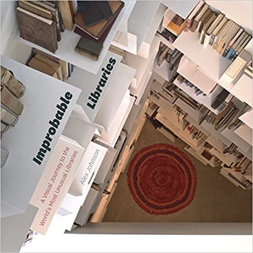
But while that libary does appear in the book, there were various issues that couldn’t be resolved using it on the cover so instead, this is the original UK first edition which I also think gives a good idea of some of the ingenious designs inside.

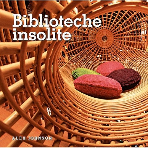
They didn’t do too much with it in Japanese.

But in Italian they went quite a different route. I love the shot, but personally I’d have chosen one with actual books in it.
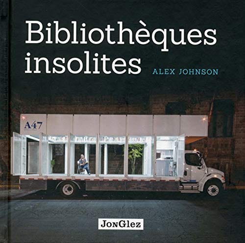
I have no idea if the French and Dutch publishers worked together but…

And even though it’s exactly the same text in English, in the USA it looks like this. Plenty of books, but low on the improbability factor I’d suggest.
Next week I’ll do the same with Bookshelf which was born in this manner:

What I read last week: I finished Malcolm Saville’s Jane’s Country Year which has an excellent introduction by Hazel Sheeky Bird of the University of Newcastle, plus 32 full colour illustrations by Bernard Bowerman from the 1946 first edition.
What I’m reading this week: Neck-Verse by UA Fanthorpe, one of my buys during last week’s trip to the Peak District from the excellent Hawkridge Books in Bakewell.
What I’m planning to read next week: Osebol: Voices from a Swedish Village by Marit Kapla which I bought last year after reading a review in The Guardian.