


The Book Lover's Almanac: Illustrations
'What is the use of a book,' thought Alice, 'without pictures or conversations?'

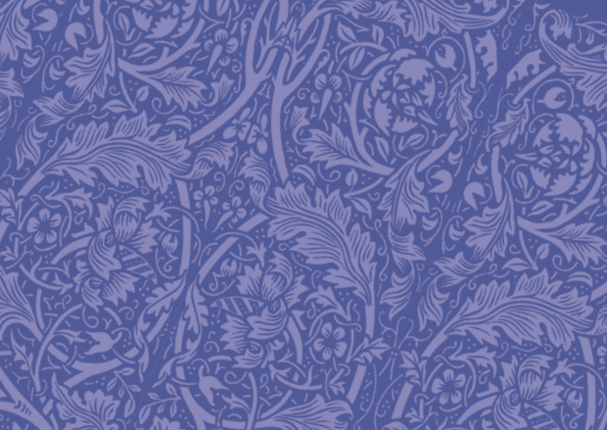
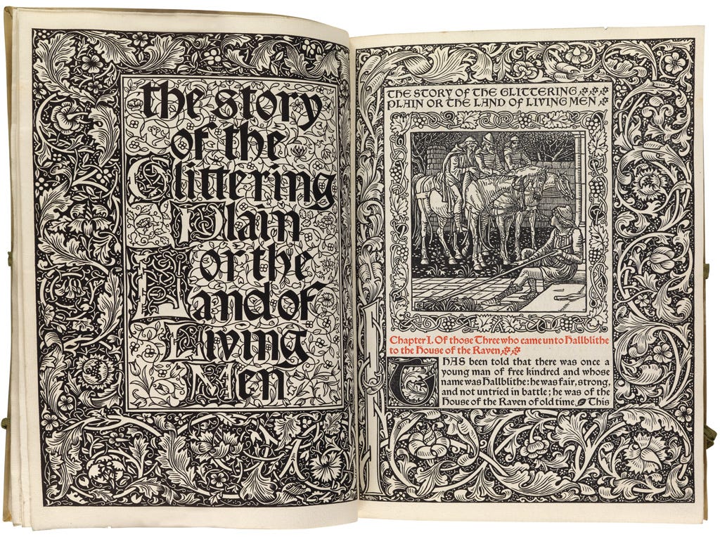
Isn’t this nice? It is in fact the endpapers for my new volume (out next week) The Book Lover’s Almanac, a border pattern replicated from the title page of The Story of Glittery Plain or The Land of Living Men by William Morris (Kelmscott Press, 1894. This is how that looks:
And this is how, enlivened by colour, it translates to the cover:
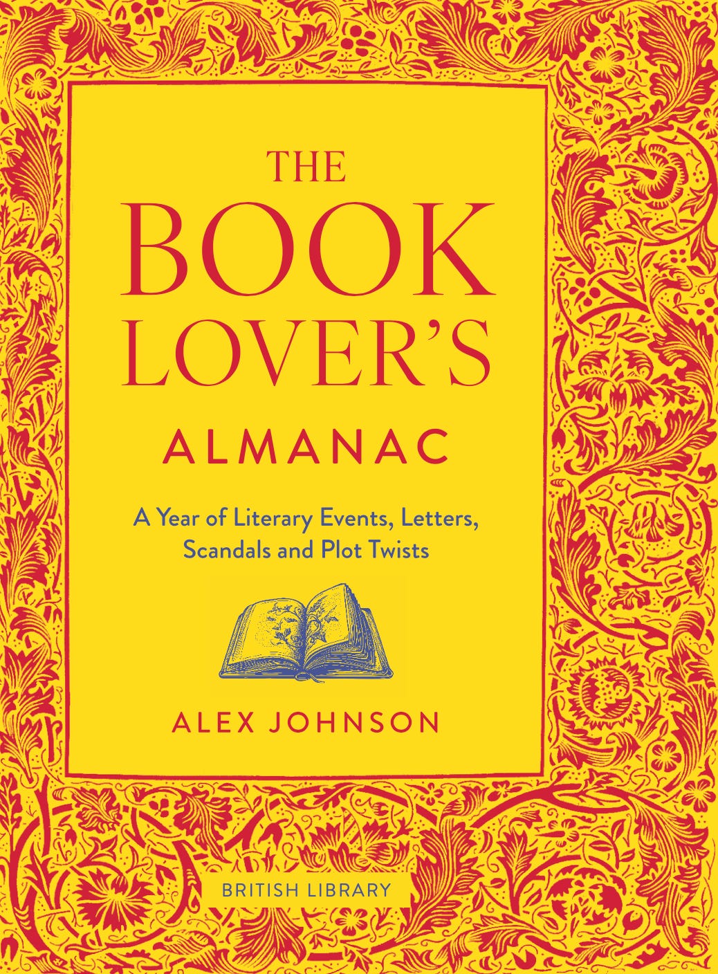
It’s the work of Goldust Design which has worked on previous books published by the British Library.
Moving on to the inside, one of my bugbears about non-fiction is not the lack of conversations, but the frequent absence of illustrative matter. And I’m not alone. Here’s a conversation I had a few years ago on whatever Twitter is called this week with Peter Frankopan, author of the excellent The Silk Roads:

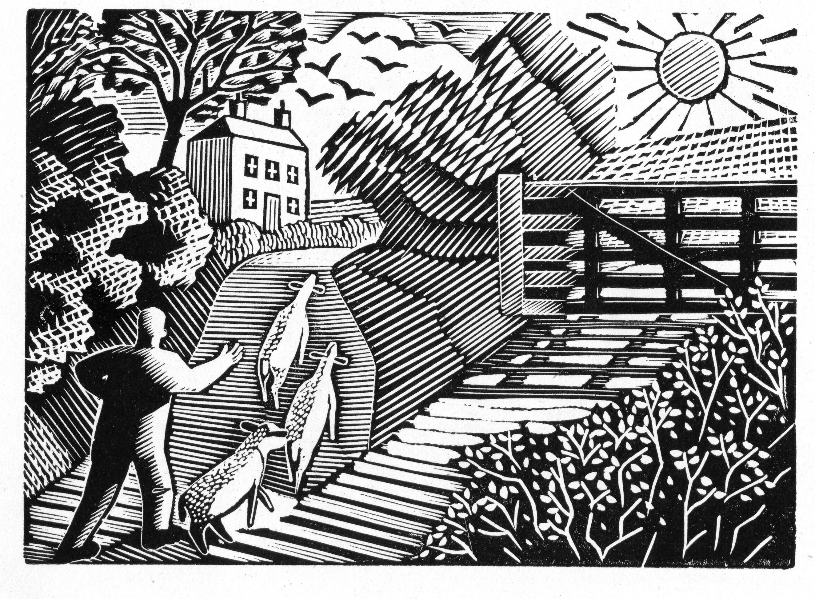
For The Book Lover’s Almanac, the original idea was to go for a generous sprinkle of woodcuts. Something like this by Eric Ravilious was how I pictured it in my mind:
But in the end we went for a rather more luscious mix of both full colour and black and white images featuring engravings, book covers, photographs, paintings, portraits, illuminated manuscripts, music scores, and press clippings, ranging in size from large postage stamp to full page. This gives a feel for how it looks, though the book in hand feels far more luxurious.


That’s a flavour of it. Next week I’ll yack on a bit about the text content.
Good yakking!
A wood cut is always a good idea isn't it