


Book covers in translation: part 2
How publishers outside the UK put their own spin on editions of my Bookshelf book


Last week I showed how Improbable Libraries looked on the shelves in countries around the world, ranging from pretty similar to pretty different. As promised, here’s the second part, how Bookshelf - still my best selling book - has been modified to appeal to different audiences.
So above is what it looks like in Korean. Compare that to what it looked like in the original English edition below.

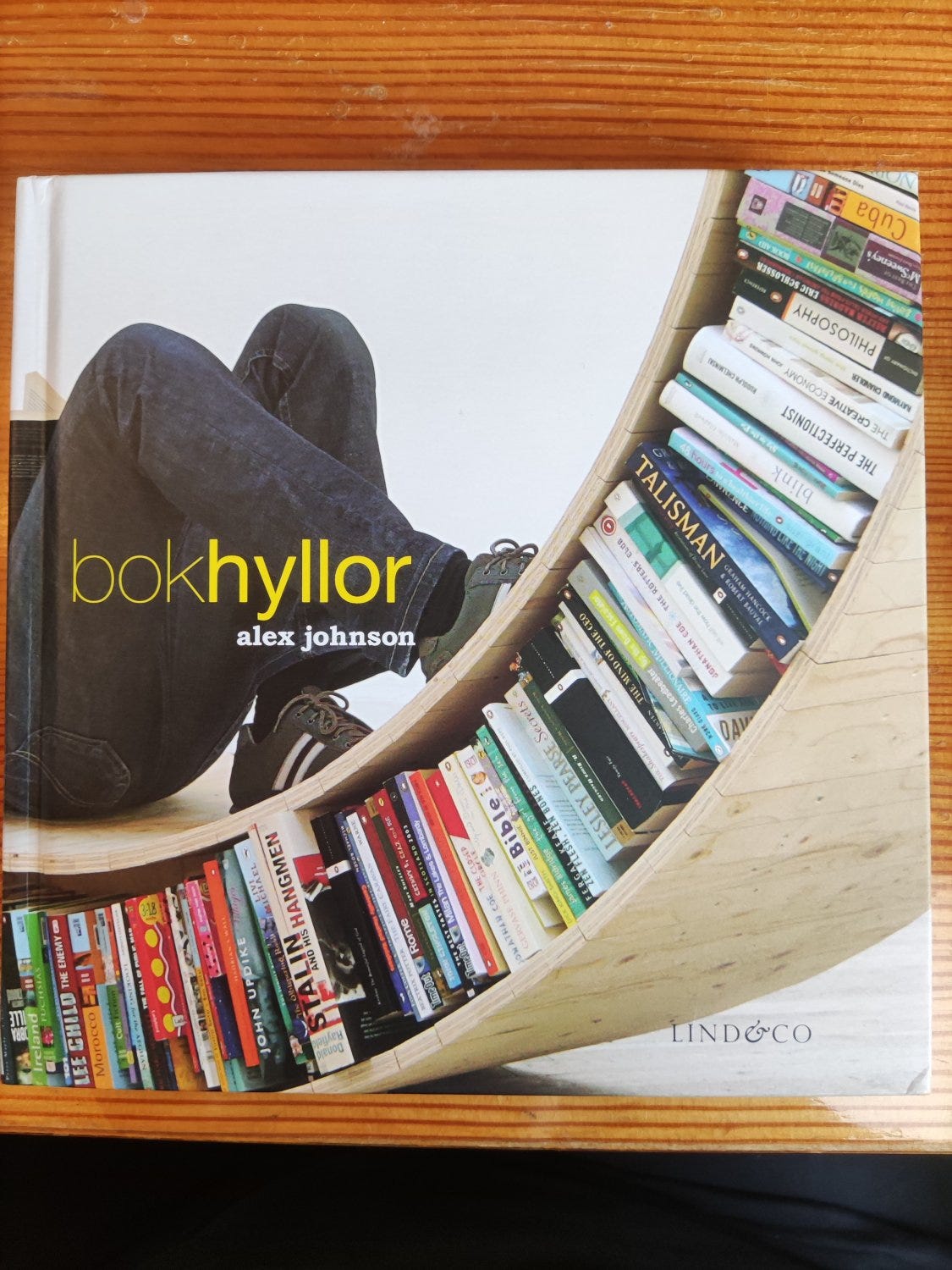
The French and Swedish publishers didn’t change much.

But the Italians really went for it. This feels very Italian to me, very cool and designery. I was told by a publisher early on in my writing career to avoid including photos of people which could date the book badly, but this looks pretty safe to me.

The German publishers DVA also went in a different direction plus, like the French, gave the readers a hint about what the book was actually about. While this might sound like overkill, one reviewer of the book on Amazon - who admittedly gave it four stars - did say that when they ordered it, they thought they were buying an actual bookshelf…

Whereas, to bring us back to the beginning, the Japanese went down the Korean route.

Next week, I’ll answer a question from one of the subscribers to The Writing Hut newsletter, ‘why do you have so many publishers?’.
What I read last week: Osebol: Voices from a Swedish Village by Marit Kapla. Nicely done oral history of a small village in rural Sweden, but a bit too long for me.
What I’m reading this week: The Lamplighters by Emma Stonex which has been on my ‘to read list’ for a year. I haven’t got far into it yet, but it’s already good.
What I’m planning to read next week: Waterloo Sunrise: London from the Sixties to Thatcher by John Davis. John was my tutor at university and we’ve kept in touch over the last 30 years so I’m particularly looking forward to this.